

From the outside, it looks like people who conduct technical analysis are magicians with PhD.'s in mathematics who "just know stuff".
Well, I'm here to tell you that's nonsense.
Technical analysis on Bitcoin means to look for patterns on the price chart and using those patterns to inform your investment decisions.
Anyone can learn how to read Bitcoin price charts and conduct technical analysis – including you.
In this article, we'll be looking at the absolute basics, which oftentimes is all you need. We'll look at the most common technical price patterns, and how to interpret them.
The same tools can be applied beyond Bitcoin; my altcoin investing article used a similar framework.
Also, it's important to remember that technical analysis does not care about why the price moves, only how it moves. Fundamentals like stock to flow and network hash rate are irrelevant.
Let's do this!
How to read price charts:
When it comes to reading price charts, and technical analysis in general, the KISS principle applies: Keep It Simple Stupid!
Do not listen to this guy:
Based on my experience, I've found that adhering to foundational principles is key, and that's exactly what we'll cover today.
After today's lesson, you'll be able to conduct technical analysis on your own and understand the ones of other people.
The Absolute Basics:
Below you see the BTC/USD price chart, showing the USD price of Bitcoin.
The red and green rectangles you see stretching across the screen are called "candles" and represent price movement within a specified time interval.
The green candles tell us that the price increased within the interval, and the red ones tell us the opposite - that it decreased.
Below, the time interval is set to one month (1M). You can see that by checking the top left corner (I have put in a blue ring to highlight it):
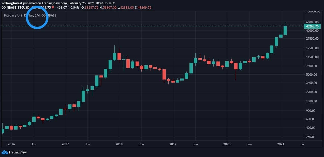
To recap what you've learned from this image:
The rectangles you see represent the price action within a given time interval.
Green candles tell us that the price has increased.
Red candles tell us that the price has decreased.
You can check the time interval in the top left corner.
Looking closer at candles:
Below you see the same image. We are still on a monthly time frame, and it's still the Bitcoin/USD price chart.
As you learned above, the candles tell us something about how the price moved within the given time interval, one month, in this case.
Let's get more specific:
Look at the two red arrows in the image below. The upper one goes from the top of a red candle, the other one goes from the bottom of the same red candle:
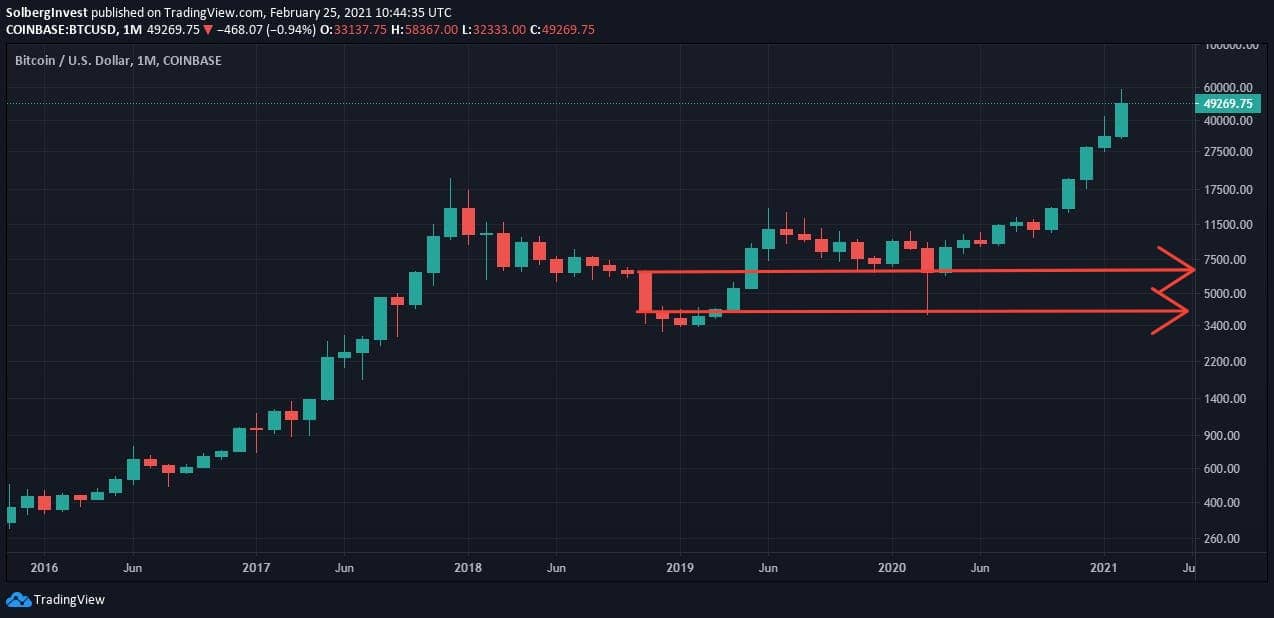
The arrows point towards the right vertical axis. The numbers you see they're pointing to are the Bitcoin / USD price.
The upper arrow points at the "opening price", which is the price at the beginning of the interval, in this case, when the month begins. The lower arrow points to the "closing price", which is the price at the end of the interval, in this case, when the month ends.
Important:
Red candles represent months when the price has decreased. Therefore the opening price is the top of the candle, and the closing price is the bottom of the candle.
Green candles represent a price increase. Therefore the opening price is the bottom of the candle, and the closing price is the top.
Wicks:
If you go back up and look at the candles, you'll notice a few thin lines sticking out above and below some of the candles.
These lines are called "wicks".
Wicks represent price spikes or dips that happened within the month but ended before the monthly close.
Example of a wick:
If we start May of 2025 at $100,000, and go all the way up to $150,000, only to fall back to $80,000 at the end of the month, how do you think the candle would look?
It would be red, with the top of the candle at $100,000 (opening price), and the bottom at $80,000 (closing price). There would also be a wick, a thin line, stretching up to $150,000.
Now you know enough to start analyzing a price chart!
Let's recap quickly:
The green and red rectangles (candles) tell us if the price has moved up or down within a given time interval.
The bottom/top of the green/red candle is the opening price, and the top/bottom of the green/red candle is the closing price.
If the price spikes/dips, but comes back down/up before the closing of the candle, we get a "wick", which is a thin line stretching above/below the candle.
You can check the time frame in the top, left corner, and the price at the right vertical axis.
Trendlines – Support and Resistance
Fundamental to any technical analysis is the concept of "Resistance" and "Support" lines (aka. trend lines):
Trend lines tell us something about the buying/selling activity of traders at given price ranges, and are the most important tool for analyzing price charts.
They help us predict where a lot of people will sell, pushing the price down, as well as where a lot of people are going to buy, pushing the price up.
This next part is key to understanding technical analysis:
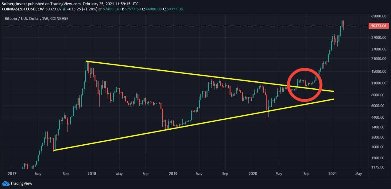
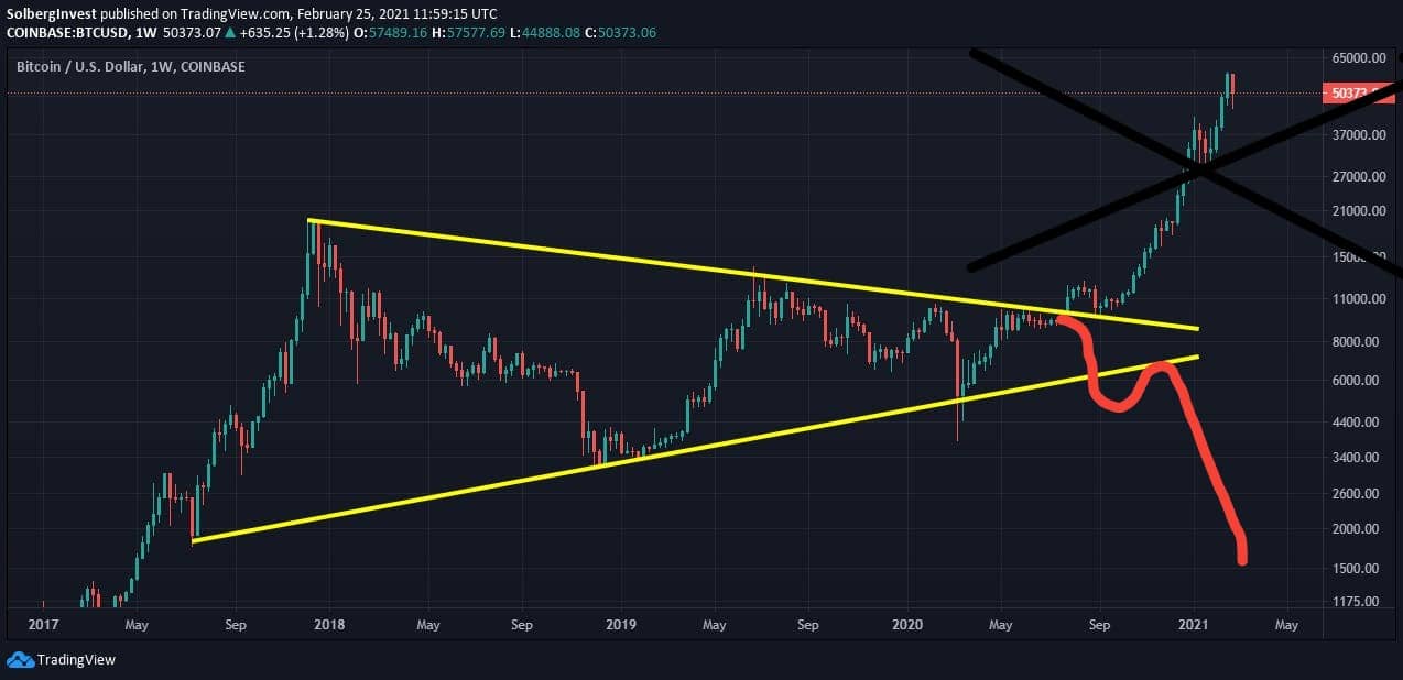
Below you see the Bitcoin / USD price chart, on a weekly time frame, with two yellow "trend lines" drawn on it.
Notice how it seems like the price was "trapped" within the two yellow lines?
Also, when the price finally broke out above the upper line, notice how it shot up like crazy?
This pattern is called a "symmetric triangle", and is generally a bullish (optimistic) sign. Let's go through it in detail so that you can learn to spot them on other price charts.
The Yellow Lines:
The lower line is called the support line. This is the "price floor" where we bounce back up, or at least don't fall below.
The upper line is called the resistance line. This acts as a roof, where the price is pushed back down whenever it nears it.
The Red Circle:
I've highlighted something with the red ring, something important - previous resistance turned into support.
We finally broke above the resistance line, and "successfully tested it as support", meaning that after breaking above it we fell back down to the line, but bounced back up (like you see in the red ring above).
Think of it as turning the previous resistance into a springboard for further growth.
When I saw previous resistance turn into support, I treated it as a bullish signal.
The opposite move—breaking support and turning it into resistance—was a bearish warning in my framework.
Turning support into resistance is bearish (pessimistic) and tells us that we are going further down.
Below you see a drawing of how the bearish scenario would play out:
What you need to remember:
Turning previous resistance into support = bullish signal
Turning previous support into resistance = bearish signal
Technical Patterns to Look For:
There are many patterns to look for when conducting technical analysis. However, some are more important than others.
Below you see some of the most common and useful patterns: (source: tradingsim.com)
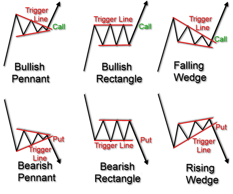
The three upper patterns are "bullish" (optimistic), and the three lower ones are bearish (pessimistic).
"Call" means to buy, and "Put" means to short.
Let's take a look at some "real-world" examples of Bitcoin technical analysis, and how to trade them:
Examples of Bitcoin Technical Analysis
In the image below you see "channels", which are parallel resistance and support lines, showing the general trends:
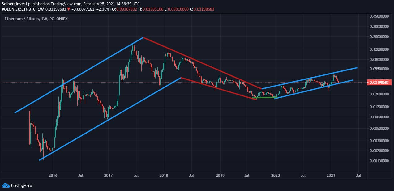
The blue lines show the up-trends and the red lines show the downtrend. The green line you see represents something we call a "double bottom".
A double bottom is bullish (optimistic), and signals a "trend shift".
This played out perfectly in the chart above; we trended down in the red channel, saw a double bottom (trend shift), and then started trending upwards.
How I use channels when investing:
In the framework I used, I would "dollar cost average" near the bottom of the channel.
I sometimes added more after spotting a double bottom that suggested a trend shift.
The goal was to lower my average entry price:
I started after a perceived trend shift and added when the price approached the lower line of the trend channel.
The red rings in the image below show where I would buy, using trend channels:
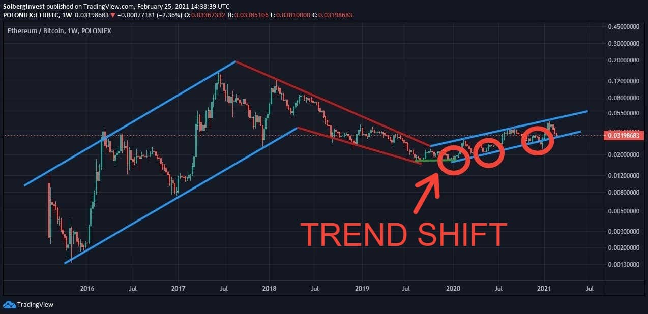
By the same logic, I would sell towards the top of the channel. The approach aimed to buy toward the bottom of the channel and sell toward the top.
Channel Combined With Support-Lines
I have highlighted the buy-zones with a green highlighter:
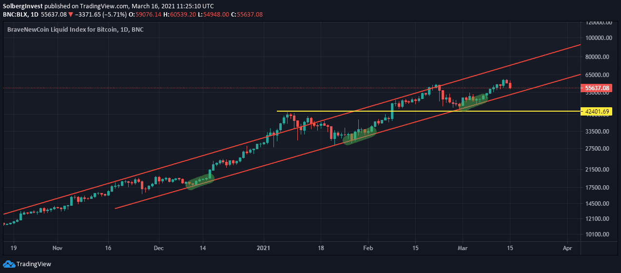
Take notice of the last buy zone. We hit "double support", meaning that both the channel and the previous high (yellow line) acted as support. I treated that as a bullish setup.
Head and shoulders Pattern
I treated a confirmed head-and-shoulders breakdown as a bearish reversal pattern.
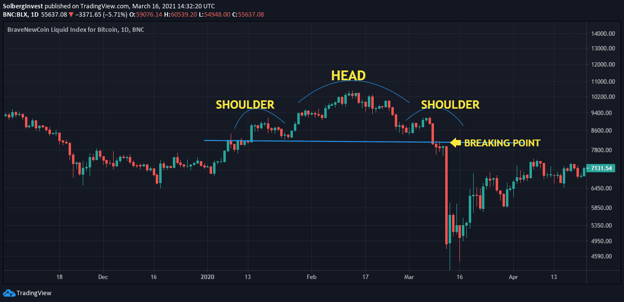
When the price broke below the "neckline", I treated it as a cue to reduce risk or temporarily move part of the position to stablecoins.
The head and shoulders pattern is one of the scariest ones out there, so be on the lookout.
Get Started With Technical Analysis on Bitcoin:
For these examples I used TradingView to analyze Bitcoin and altcoin charts. The walkthrough below shows the relevant chart tools.
How to Find the Bitcoin Price Chart
When you first enter tradingview.com, it's overwhelming... There's all kinds of flashing stuff and numbers and graphs.
Stay calm, this is what you need to do:
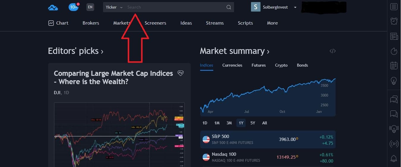
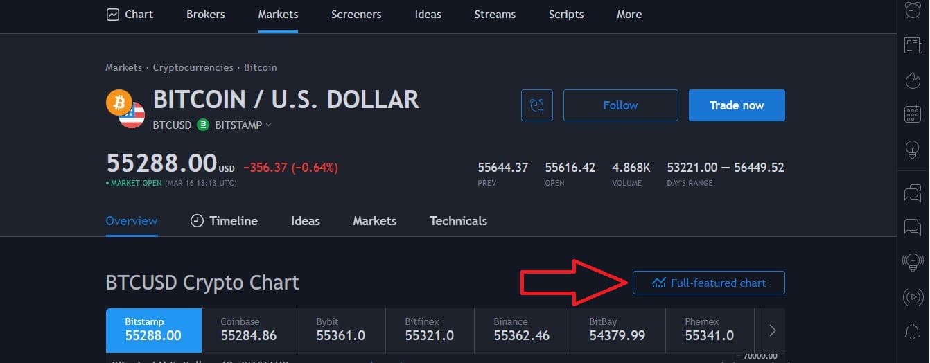
Go to tradingview.com and search for the chart you want to analyze. To analyze the Bitcoin chart, you need to type in "BTCUSD"
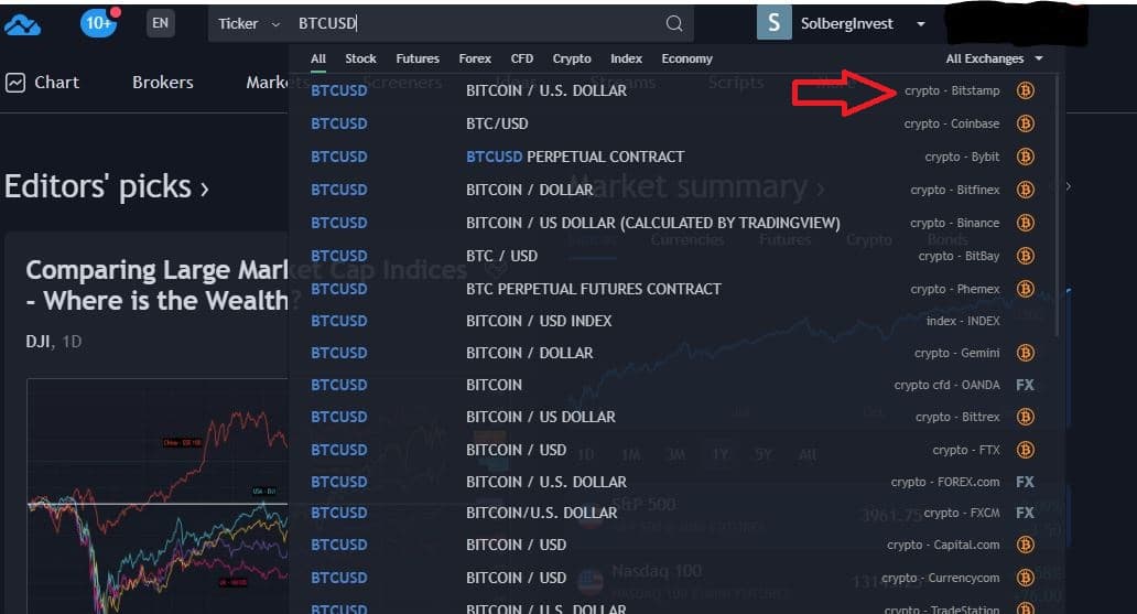
Once you've put in "BTCUSD" a list will show. This list is all the different sources of price data you can choose from.
For instance, you can choose Binance as a data source, which will give you the data all the way back to when Binance started selling Bitcoin.
You generally want to look at the chart with the longest history of price data, which is BLX and Bitstamp.
Now, you want to click on the button that says "Full-featured chart"
How to Use the Tools in Tradingview
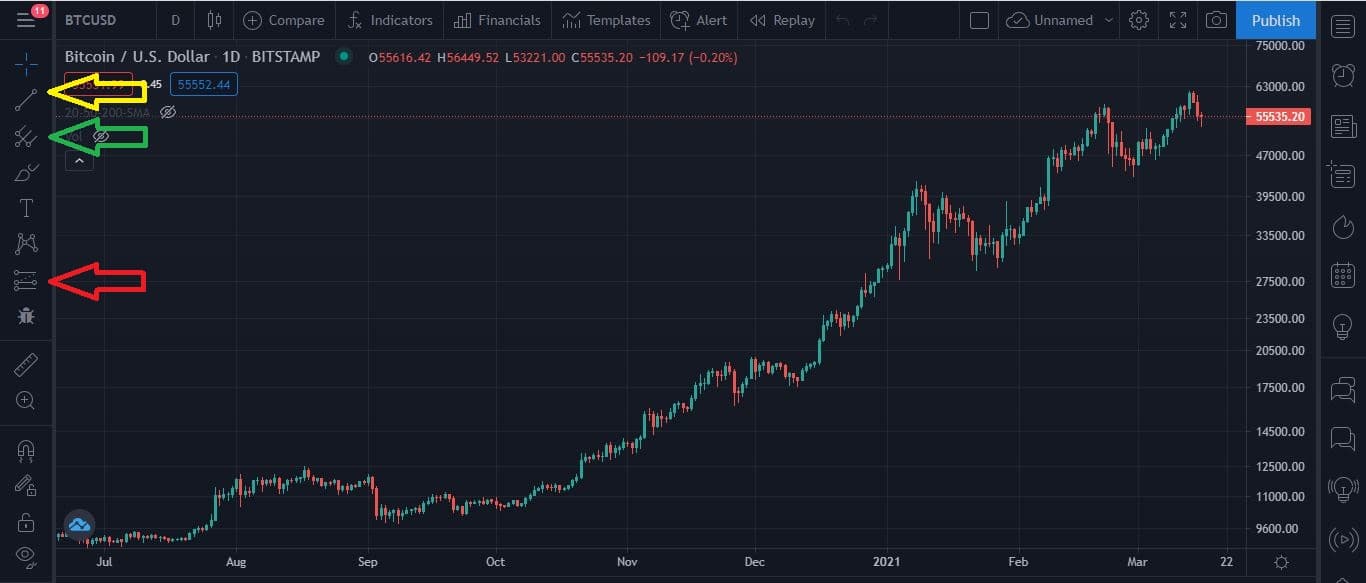
You're now looking at the chart, with all the tools needed to conduct technical analysis on Bitcoin.
Let's look at what tools you can use. I will tell you the most important ones, like how to draw trendlines and measure the percentage of specific moves etc.
Below you see a few colored arrows. Each arrow points to an important set of tools.
The yellow arrow: Tools you will use to draw trendlines and channels.
The green arrow: Tools to use for finding technical levels of support and resistance, like Fibonacci retracement levels etc.
The Red arrow: Measuring tools to check out how many percentage a specific move was, or how many days/weeks/months the move took.
Paralysis From Analysis:
I firmly believe in “KISS”. Not the band, but the principal. “Keep it Simple, Stupid.”
It’s easy to get super technical and drown yourself in Fibonacci retracement levels, trend lines on the five-minute candles, and all kinds of technical nonsense.
In my experience, this only clouds your judgment. Leave this stuff to the day traders. They are the only ones who benefit from looking at these things, not us.
We focus on buying low, holding for a long time, and selling high.
I don’t care if you use super technical, ultra-futuristic, mega algorithmic pattern-recognizing software support to trade. Most people lose money when they try to daytrade Bitcoin, even if they use advanced technical analysis.
My preference was to buy at lower valuations, hold through the long-term trend, and sell into strength.
This makes everything a hundred times easier as well, as you don’t need to keep track of fifteen different things or go through the nightmare of figuring out the taxes on all your trades at the end of the year.