
There are ways of knowing if Bitcoin is in a bullmarket, and you’ll learn them in this article:
Every bullmarket we’ve seen so far have been signaled by two things; a Golden Cross, and holding the 20-week moving average as support for a few months.
I cringe every time I read/hear “Bitcoin is going parabolic, I believe it’ll go to one million dollars next year!”. They rarely back it up with anything other than intuition, as well as pointing to some random altcoin that 100x’ed in the last cycle which “proves” that it’s possible Bitcoin can do it as well.
What we’re going to look at in this article is data-science, objective metrics and technical indicators that actually help us know when we enter a bullmarket.
Bitcoin Bullmarket Indicator #1
Golden Cross & Death Cross
What are they, and what do they tell us?
Golden crosses and death crosses are technical indicators that signals a shift in general market sentiment. Now, what the heck does that mean?
Golden Cross:
Golden crosses are one of the most bullish signs there is. In Bitcoins history there has only been six of them, and every single bullmarket has been signaled by a golden cross.
Now, this does not mean that every golden cross signal a coming bullmarket, but before every bullmarket there has always been a golden cross.
In other words: A golden cross is necessary, but not sufficient to confirm the bullmarket has arrived.
Well then, what exactly is a golden cross?
To understand what a golden cross is, we have to talk about moving averages.
A moving average is simply the average closing price of Bitcoin over a specified amount of time.
The 50-day moving average is the average closing price of the last 50 days. The 20-week moving average is the average closing price of the last 20 weeks.
Okey, so now that you know what a moving average is, we can get back to the golden cross, and finally define it:
A golden cross refers to the event that takes place when the 50-day moving average crosses over the 200-day moving average. This is one of the most bullish sign there is, and signals a comming bullmarket.
How are we to interpret this?
Well, it’s simple really: The fact that the 50DMA goes above the 200DMA means that the average price of the last 50 days is higher than the average price of the last 200 days.
In other words, we are moving upwards, and have been for a while.
Below you see a chart of the Bitcoin price together with a few arrows. The yellow ones show the golden crosses, while the red ones show something called “Death Crosess”, which are the opposite.
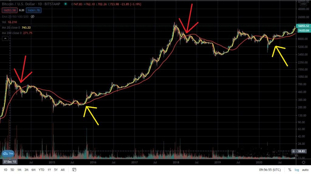
The red line is the 200 day moving average, the yellow one is the 50 day moving average.
See how the bullmarket is signaled by a goldencross, and how the bearmarkets are signaled by a death cross?
If you’re an astute observer you’ve noticed that sometimes we get a golden cross without a bullmarket following afterwards. This is because the goldencross alone can’t confirm the bullmarket.
A goldencross is necessary, but not sufficient, to confirm a bullmarket. There is one more thing we need, we’ll get into that later in this article.
Death crosses
Death crosses are the opposite of golden crosses. They signal the end of a bullmarket, and beginning of a bear market.
Death crosses occur whenever the 50 day moving average goes below the 200 day moving average. This simply means that the average price of the last 50 days are lower than the average price of the last 200 days.
In other words, death crosses signal that we’re moving down, and have been for a while.
Bitcoin Bullmarket Indicator #2
The 20-week moving average
We have to see a golden cross to know that Bitcoin is in a bullmarket, but we need more than just that.
We need to see Bitcoin holding the 20 week moving average as support.
“What the heck does that mean?”
Let me explain:
The 20WMA is the average closing price of the last 20 weeks. It’s represented by the line that’s hugging the price-candels on the chart below.
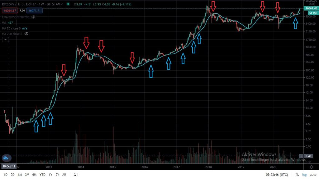
Here we see the price of Bitcoin, as well as the 20WMA. Do you see the way that the price keeps touching the 20WMA, and bounces back up, when we’re in a bullmarket?
Holding the 20WMA as support simply means that the price stops falling at that level, and bounces back up.
The Bitcoin price has held the 20WMA as support in every single bullrun ever.
Therefore I assume that this needs to happen before we can confirm that we’re in a bullmarket.
So, the way to know if Bitcoin is in a bullmarket is to look for a golden cross, and if we’re holding the 20WMA as support.
In my newsletter I send weekly updates on how we’re doing in relation to the most important technical indicators, as well as the metrics we’re going to look at after this.
Sign up to make sure you’re ready for the bullmarket, and be notified when the bearmarket is around the corner.
By signing up you can also download my free guide on how to increase ROI
Predicting the Bullmarket
It’s great to be able to know when we’re in a bullmarket, but whats even better is to be able predict it. Let me explain:
If you’re able to predict the bullmarket, you can invest before the prices start going up.
If you predict a bullmarket, you get in at the bottom, which is the key when it comes to investing in crypto.
Let’s take a look at how much it impact your ROI to get in right before the bullmarket, instead of right after:
Lets say you invest ten grand into Bitcoin. We assume that the price is 7 000$ per Bitcoin before the bullmarket, and 10 000$ one week after the bullmarket has started.
At the end of the bullmarket, the price per Bitcoin is 100 000$, and this is where you sell everything.
Okey, so if you predicted the bullmarket you’ve invested ten grand at 7 000$, and at 10 000$ if you didn’t, and you’ve sold everything at 100 000$.
If you predicted the bullmarket, you would’ve been able to buy 10 000 / 7 000 = 1.428 BTC. If you didn’t predict it you would’ve gotten 1 BTC.
After selling it at a Bitcoinprice of 100 000$, the difference sums up to 42 800 bucks. That’s a lot of money. The ROI increases from 10x to 14x.
In other words:
The ROI of getting in at 7k instead of 10k is 428% higher.
“Great stuff man, but how do I predict the bullmarket?”
This is how:
General market sentiment
Altcoins going crazy, HODL wave and other metrics
There are a few things that signal the coming of a bullmarket. A golden cross, as we’ve already talked about, altcoins going crazy, HODL wave increase and other specific metrics.
Let’s start with altcoins:
Altcoins going crazy
Altcoins going crazy if often a sign that the bullmarket is just around the corner. When we see coins going through the roof, something big is happening.
Now, when I say “crazy”, what I’m talking about is coins seemingly out of nowhere going 5x in 10 days. It’s often a new category of projects, like DeFi, or NFTs where a handful of coins go absolutely parabolic.
We’ve saw this in 2020. Chainlink, KAVA, BAND Protocol, Aave and others went parabolic.
The fact that DeFi projects like these are going crazy is a sign of optimism. It means that people are willing to speculate, and that they are ready, and expect rising prices soon.
This, combined with the next factors is a huge sign of a coming cryptobullmarket.
Using Bitcoin metrics to predict the bullmarket:
There are specific metrics we can use to predict how Bitcoin is going to do in the future. These are:
Bitcoin Metric #1:
Daily active adresses
The number of daily active addresses tells us how many people are actually using/buying/selling Bitcoin on a daily basis.
This tends to have a close relationship to the price of Bitcoin. They rise together, and fall together.
Below you see a chart showing us the change in active addresses compared to the bitcoin price (Source: Coinmetrics.io).
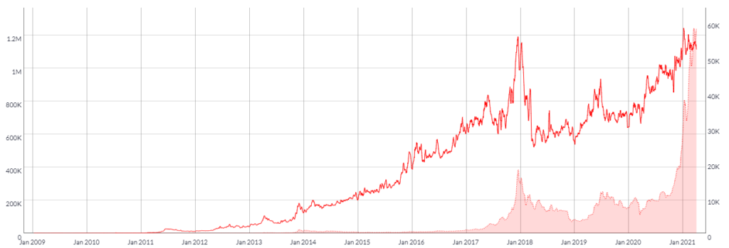
The red line is the number of active addresses, the left vertical axis gives the number. As you can see, it follows the price to some degree, peaking together in the end of 2017. It then fell down , but as the price started to move up, the number of active addresses are also moving up.
Bitcoin Metric #2:
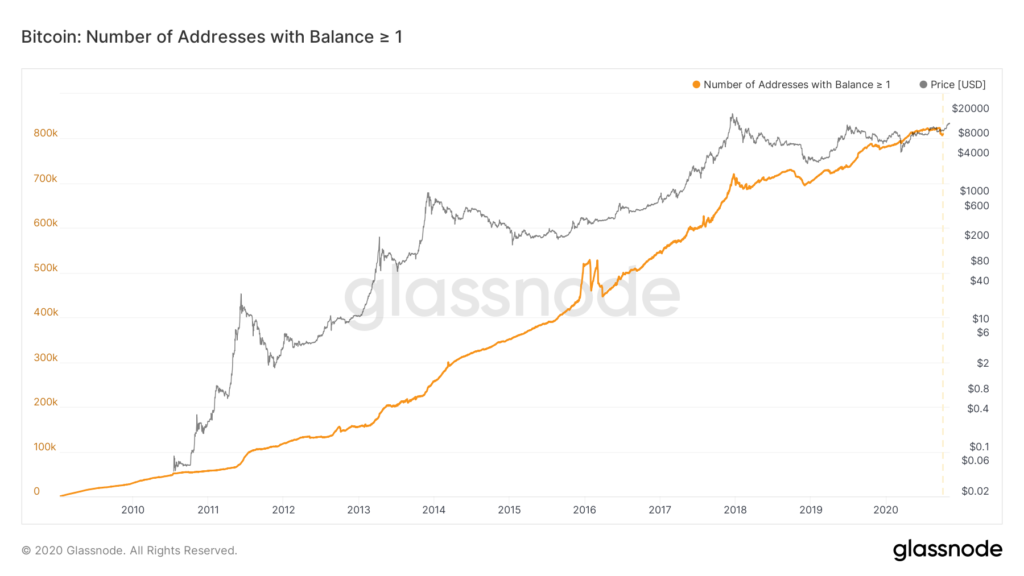
Wallets with more than 0 BTC
The number of addresses with more than 0 BTC tells us how many wallets there is that contains BTC. This is important, as it tells us something about how many people are investing in it.
This tends to have a close relationship with Bitcoin. The price usually follow this metrics, with a slight lag. You can take advantage of this time-differance if you follow it closely.
If this metric increases, that means more people are getting into Bitcoin. When more people are getting into Bitcoin, the price eventually rise.
Below you see a chart showing the number of Bitcoin addresses with more than 0 BTC (source: studio.glassnode.com)
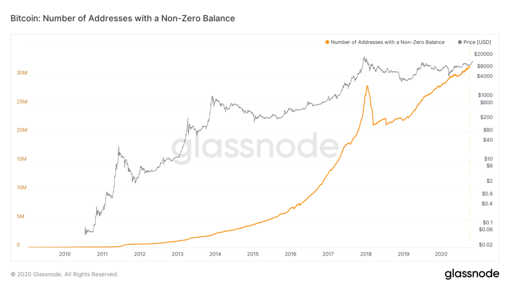
As you can see the number of non-zero Bitcoin addresses is increasing. We are way past our previous all time high back in 2017. This is great news, as it shows us that there are tons of new people into Bitcoin.
Bitcoin Metric #3:
Wallets with more than 1 BTC
The number of addresses with more than 1 BTC tells us how many wallets there is that contains 1 BTC or more. This is important, as it tells us something about how many people are seriously investing in Bitcoin, putting significant amounts of money into it.
This tends to have a close relationship with Bitcoin. The price usually follow this metrics, with a significant lag. You can take advantage of this time-difference if you follow it closely.
What’s great about this is that for every Bitcoin that’s kept on a wallet, there is one Bitcoin less in circulation. This means that new buyers have to fight over fewer Bitcoins, pushing the price up.
It’s more complicated than that of course, but you get the point. More addresses having one or more Bitcoin means that when new buyer come in, they push the price higher.
Below you see a chart showing the number of Bitcoin addresses with more than one BTC (source: studio.glassnode.com).
Bitcoin Metric #4:
The HODL Wave
The HODL Wave is an interesting metric, and probably one of the most important ones.
HODL means “hold on for dear life”. If you HODL Bitcoin, you hold it long-term. You don’t sell when the price falls. You don’t sell when the price increases. You just don’t sell at all. Maybe some day, but not in the near term, that’s for sure.
The HODL wave tells us how many people are HODL’ing Bitcoin.
HODL is more of a meme than a strategy at this point, but here’s what we can get out of this metric:
The basic rules that decide the price of Bitcoin is supply vs. demand. If the demand increases relative to the supply, the price rises. If the opposite happens, the price decreases.
The HODL’ers of the market accumulate what Bitcoin they can, and holds it in their wallet. This makes the supply fall, as there are less available Bitcoin to buy.
This means that:
If the number of people HODL’ing increases, the supply decreases.
This is great, but the price don’t react to the HODL wave immediately. The price starts rising when we get new buyers.
Let’s say there’s 100 BTC in circulation, and I decide to buy 50 of them and HODL for a few years. Later when other people come to buy the 50 remaining Bitcoin the supply will be lower relative to the demand, than it would be if I didn’t scoop up and HODL the 50 Bitcoins.
Make sense?
Below you see the chart showing Bitcoins price together with the one year HODL wave:
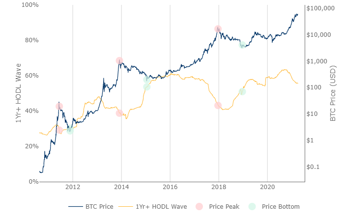
The blue line is the Bitcoin price, and the yellow line is the HODL Wave, indicating the number of Bitcoins that’s been HODL’ed for a minimum of one year.
It’s clear to see that the HODL wave of Bitcoin has an inverse relationship to the price of Bitcoin, meaning that they move in opposite directions.
The astute observer will notice that we’re forming the same pattern we did in 2016, which kicked of the last bullmarket that gave us approximately a 100x gain on Bitcoin.
The fact that this metric is moving down is confirmation that we’re in a bullmarket.
Takeaways from this article
There are two key things that we need to confirm that we’re in a bullmarket:
A golden cross and that we’re holding the 20 week moving average as support.
To predict the bullmarket we can look at two things:
Altcoins going crazy and the different metrics we looked at.
Prepare for the Bitcoin Bullmarket:
How the heck are you going to keep up with all the different metrics, the altcoins prices and the different moving averages?
How in the world can you stay up to date on all this, and live a normal life?
Don’t worry abut it. Let me do it for you! After all, I don’t have a normal life to live, and researching Bitcoin and cryptocurrencies are my passion.
Jokes aside, I urge you to keep up with these metrics, as it can make a huge difference in your ROI.
Download my free guide on how to increase ROI, and sign up to my newsletter:
If you liked this article, please share it with your friends or on Facebook, it help a lot.