

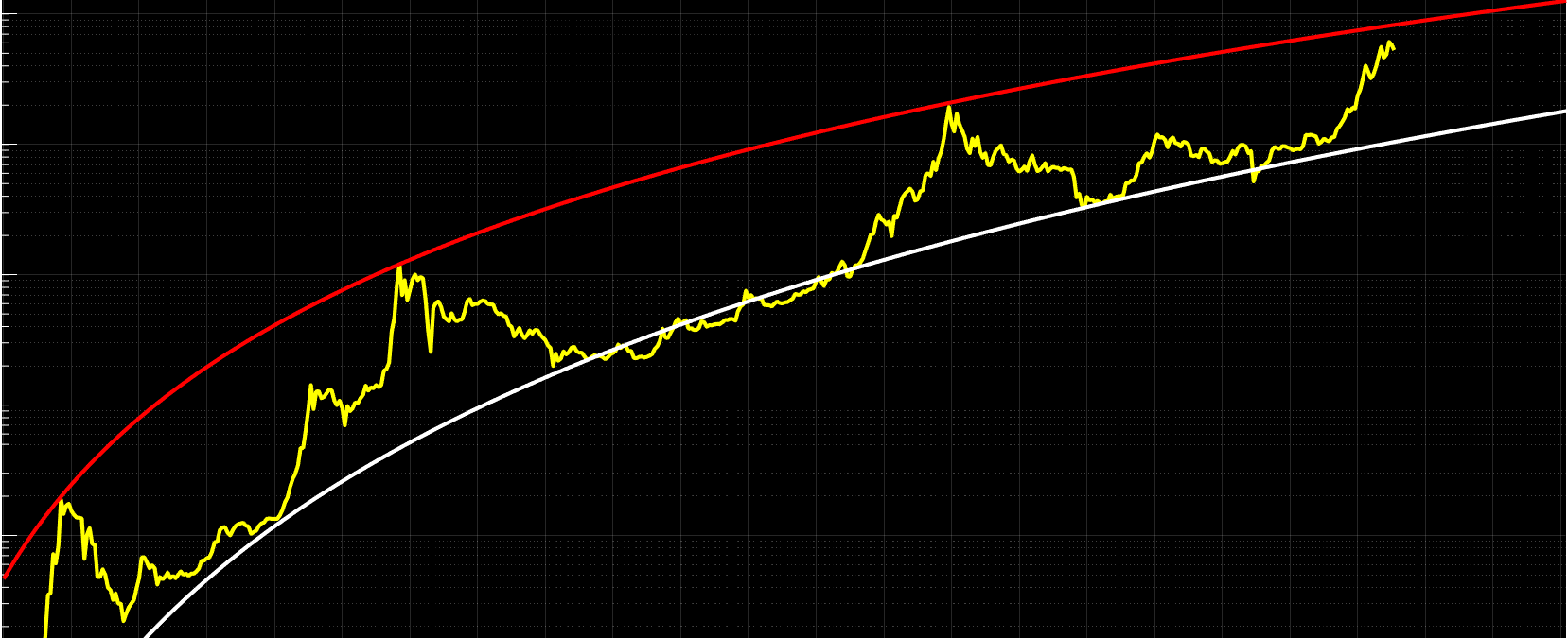
This archived 2021 model plotted a long-term logarithmic band around Bitcoin's historical price. I used it to frame a possible cycle peak and a potential accumulation area after a decline.
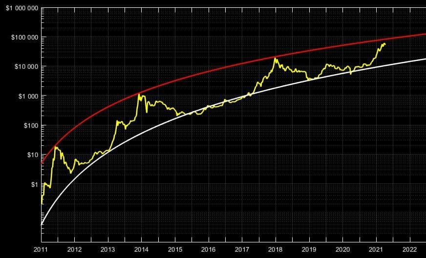
This model shows the long term logarithmic support/resistance lines for the Bitcoin price, going all the way back to 2011.
The upper line was fitted to areas reached before prior multi-year bear markets.
The white line marked an area Bitcoin had returned to between prior bear and bull markets:
How to Read This Model:
The yellow line is the Bitcoin price, going all the way back to 2011.
The red line is a logarithmic trend line fitted to the three major Bitcoin peaks in the historical sample.
Each historical touch of the red line was followed by a sharp decline and a multi-year bear market.
The white line marks the area Bitcoin returned to after those declines.
Historically, I treated the area near this line as a potential accumulation zone.
How I Intended to Use This Model:
I planned to sell a significant portion of my Bitcoin as price approached the red line.
After a future decline, I planned to accumulate near the white line.
Under this model, a 2021 peak at the upper band would imply a Bitcoin price above $100,000.