

While $BTC stays under the $87K to $90.5K resistance, I see it as a place to accumulate, with the lower support areas as better entries if we dip. $SPX has bounced from its support and is pushing on a falling wedge. I'm in with a small size. A daily close above the wedge is my confirmation, and losing the support area invalidates the setup for the short term.
The answer in brief
$BTC is still stuck under the resistance area I gave you a few weeks ago, and that's fine by me.
While we stay under it, I see it as a place to accumulate.
On $SPX, I've entered with a small size after the bounce from the $0.38 to $0.40 support.
The support area is the line in the sand, and a break out of the wedge is the confirmation.
If we lose that support area, the setup is off for the short term, and I'll say so.
Where $BTC is stuck
Since last week, not much has happened in the markets, which was somewhat expected.
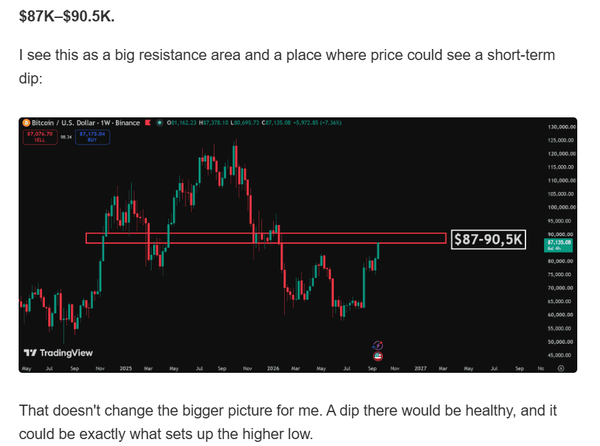
A few weeks ago, I laid out the resistance area at $87K to $90.5K. I said it could be a place where price stalls and a dip could occur. Since then, we've entered it, and price did exactly that.
Here's the chart from that letter:
Repeated attempts at resistance
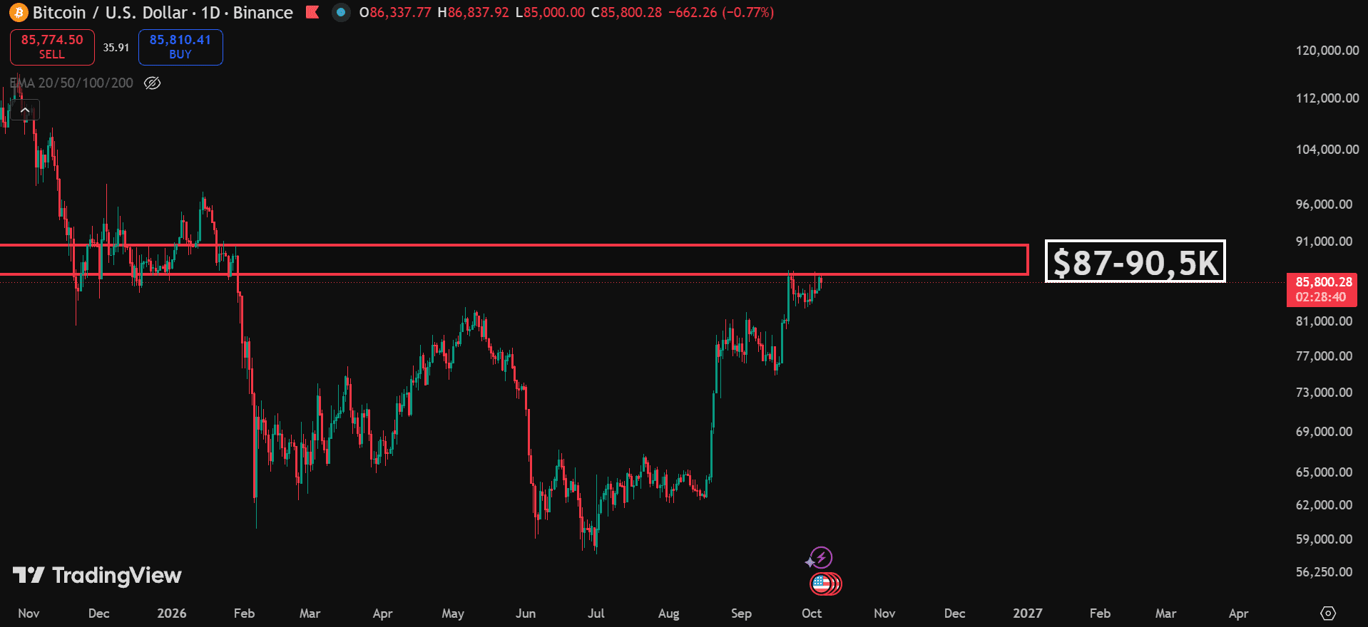
This area has been hard resistance for $BTC. In the newsletter sent on 6 October 2026, I described roughly two weeks of repeated attempts to break through it without success.
The daily chart below shows the area I am watching. My resistance zone is $87K to $90.5K. A move toward that zone is not the same as a confirmed break above it.
These charts and levels reflect that newsletter's setup, rather than a live price feed.
Why I see room to accumulate
So here's my take: while we stay under this area, it's a great place for accumulation.
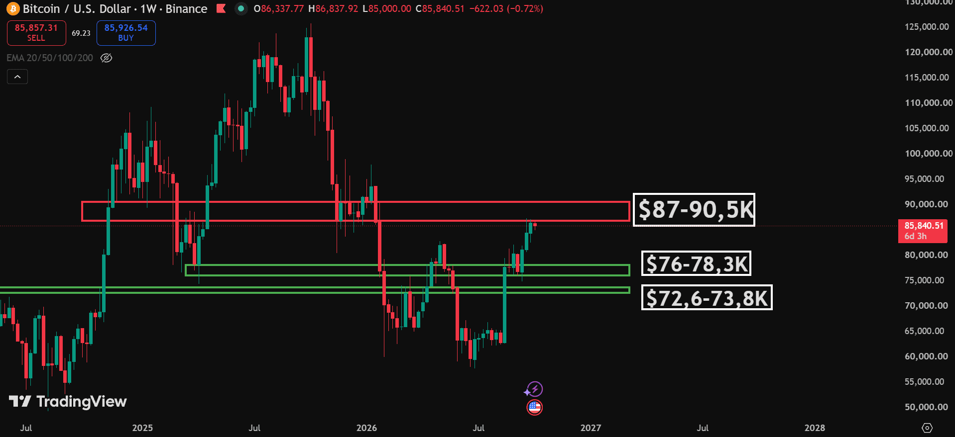
I also gave out two big support areas in the previous newsletter:
$76K to $78.3K
$72.6K to $73.8K
I'm not saying we're going down there. These are simply areas where we could find support if we do drop, and they would be great entry areas in that case.
As I wrote in the earlier letter, a dip could be healthy and could set up a higher low. That is the scenario behind my view, not a prediction that either support area must be reached.
Louis's newsletter explains the $87K to $90.5K resistance area and the two support areas below it. His next updates will follow how the setup develops. For faster updates and setups like this, see how the Solberg Invest community works. See how the Solberg Invest community works
Now, the coin I wrote about
In my last letter, I said I would share a coin in the community, and in this newsletter I shared it as well.
The coin is $SPX.
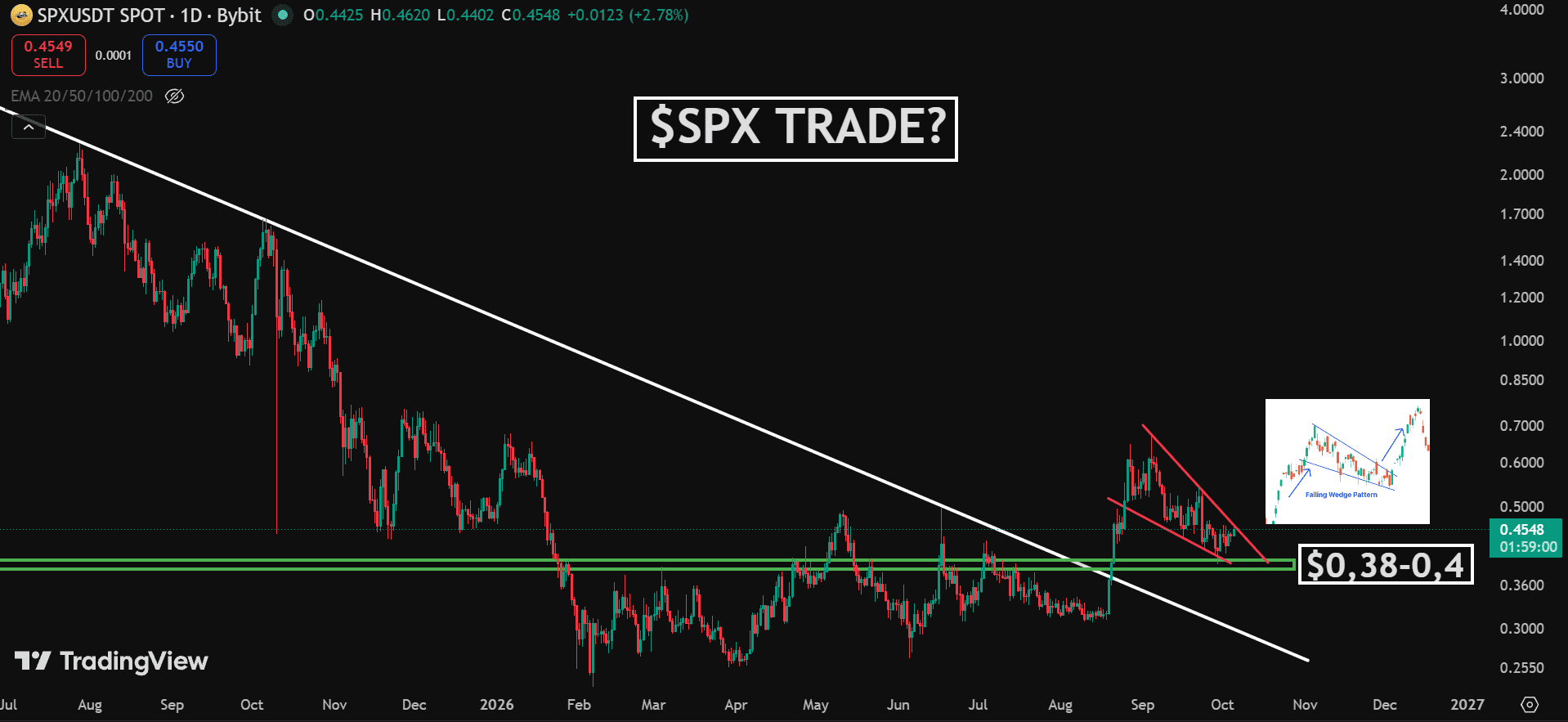
In the community, I wrote that I would enter if we saw a good reaction at the support area of $0.38 to $0.40. Price moved down to that area and then bounced. I have already entered with a small size.
Here is the daily chart from the newsletter. It shows the support area and the falling wedge I am watching.
What I'm seeing on the chart
There are four parts to the setup I described in the newsletter.
1. The big trendline is broken. The white line had rejected $SPX for just over a year. In August, price broke through it and rallied sharply. That strength is part of why I find the chart interesting.
2. The support held. After the breakout, price pulled back into $0.38 to $0.40. This area had acted as both support and resistance, and it is acting as support again in the source chart. That is the retest I was waiting for.
3. A falling wedge is forming. The red lines show the wedge in the pullback. Price is pushing against the upper line in the newsletter chart. I am watching for a break to the upside, but the pattern does not guarantee one.
4. The trend may be shifting. The higher highs and higher lows I referred to are the broader swings since the bottom. The wedge describes the more recent pullback. Those are different timeframes, so a falling wedge can sit inside a broader recovery.
What could go wrong
The wedge has not confirmed a breakout in the setup described here. A push toward its upper line could fail and leave price inside the pattern.
The support area matters more than the shape of the pattern. If $SPX loses $0.38, my setup is invalidated for the short term.
Bitcoin is part of the picture too. My newsletter says that this could be a good one if $BTC keeps holding up. That is a condition, not a promise that $SPX will rise.
I described this as a high risk entry. A bounce from support does not remove that risk.
What I need to see for further confirmation
In the newsletter chart, we are testing the upper line of the wedge, and it has not broken yet. Ideally, I want a clean break and a daily close above it before I fully trust this move.
If we lose the $0.38 support area, the setup is invalidated for the short term.
For me, it is simple: the support area is the line in the sand, and a break out of the wedge is the confirmation.
Until then, a bounce and a confirmed breakout are two different things. I will keep an eye on the setup and update readers when something happens.
Follow the setup from here
Louis first shared the $SPX setup in the community. The support area and the unconfirmed wedge break are the two things he is watching in this newsletter, and he has said he will update readers when something happens. For faster updates and setups like this, learn about the Solberg Invest community. Learn about the Solberg Invest community